
A property manager’s resume, rebuilt as a place worth visiting.
Gabbie has spent nine years keeping multifamily communities running in New Jersey and Georgia. I wanted her site to read like a listing for a good apartment: warm, calm, and easy to act on. It’s a single hand-built page with no framework, and her brand mark draws itself in while it loads.
- Type
- Personal Website
- Role
- Design & Front-end
- Stack
- HTML, CSS, JavaScript
The Site
One page, top to bottom.
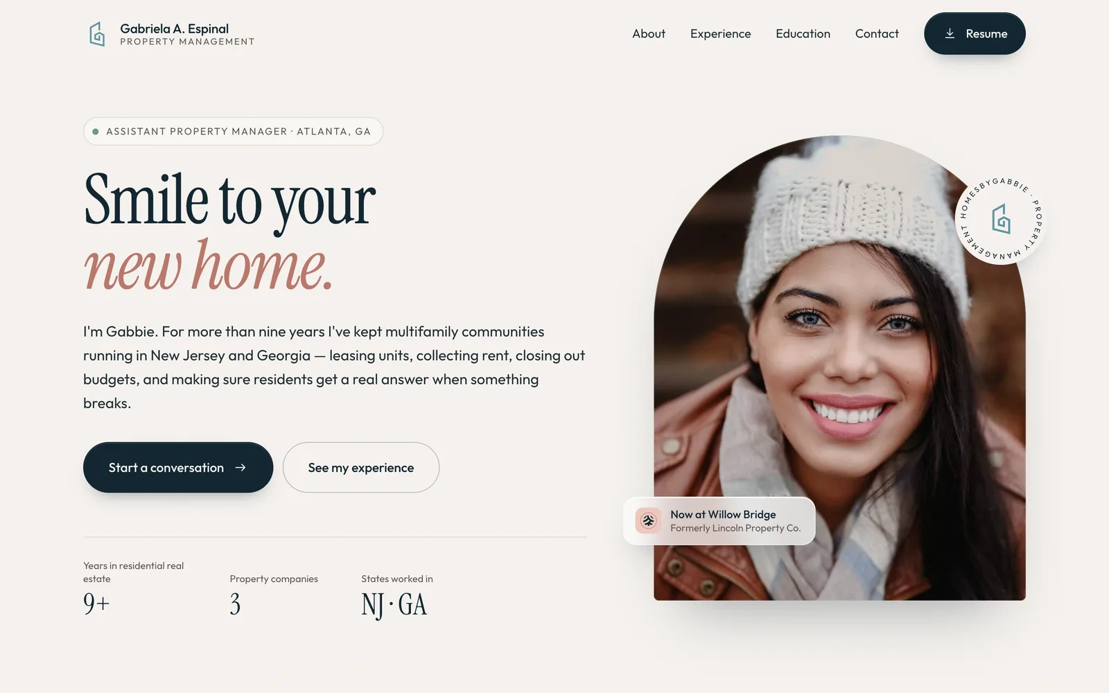
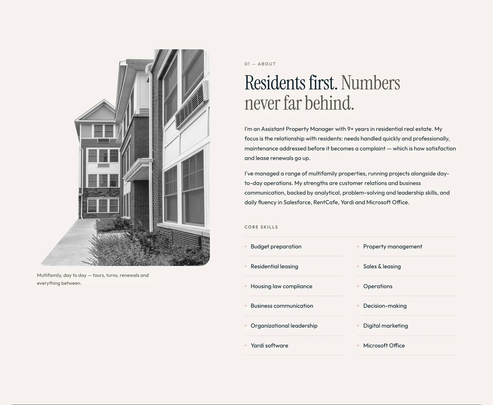
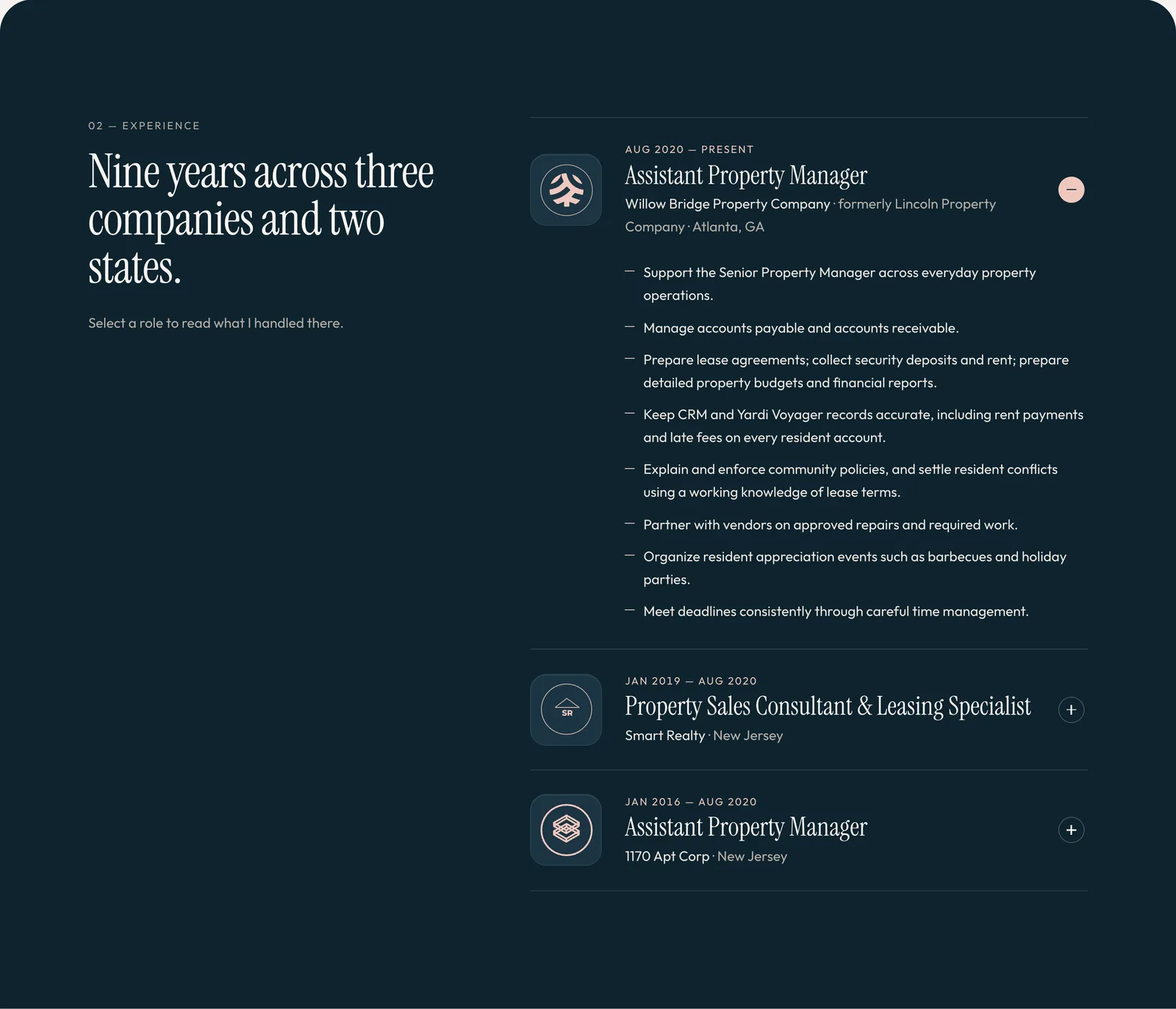
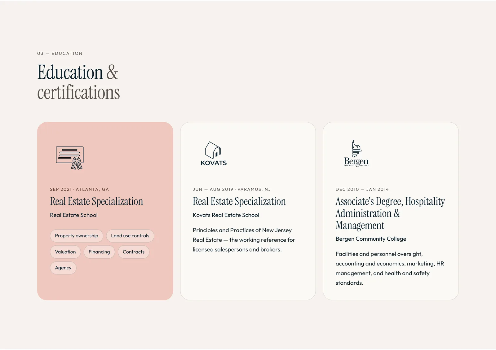
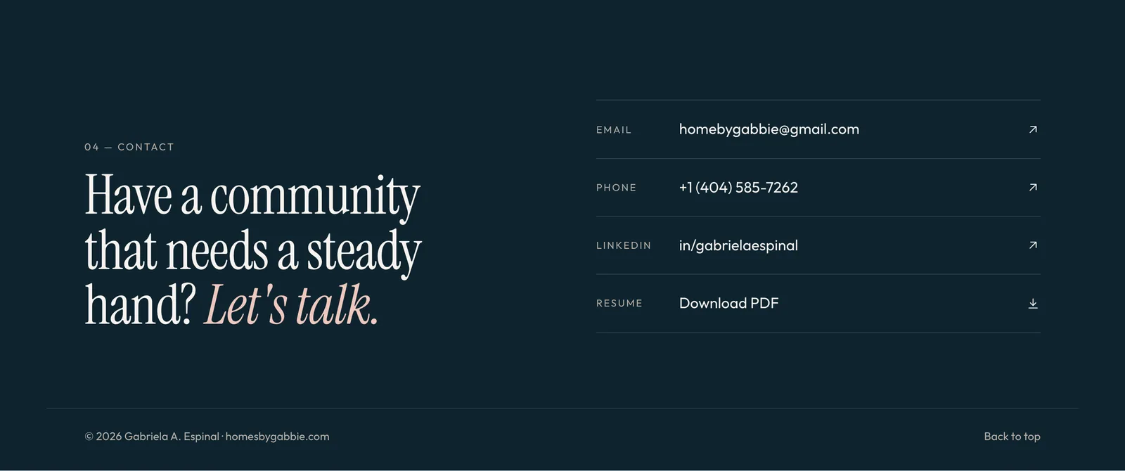
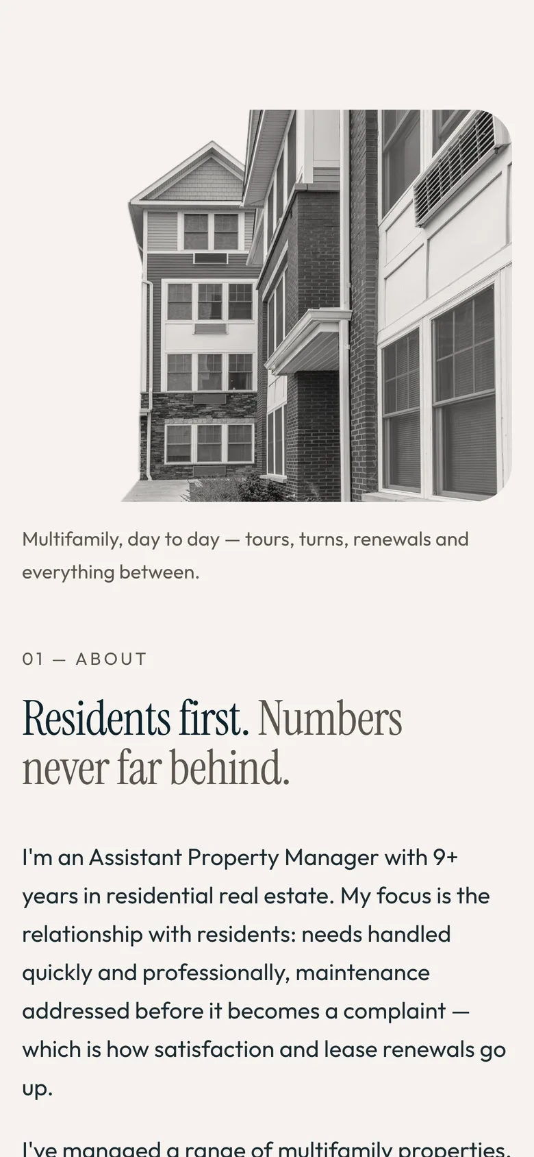
Four sections after the hero: About, Experience, Education, Contact. A recruiter or a property owner should be able to skim it in under a minute and know whether to call.
On a Phone
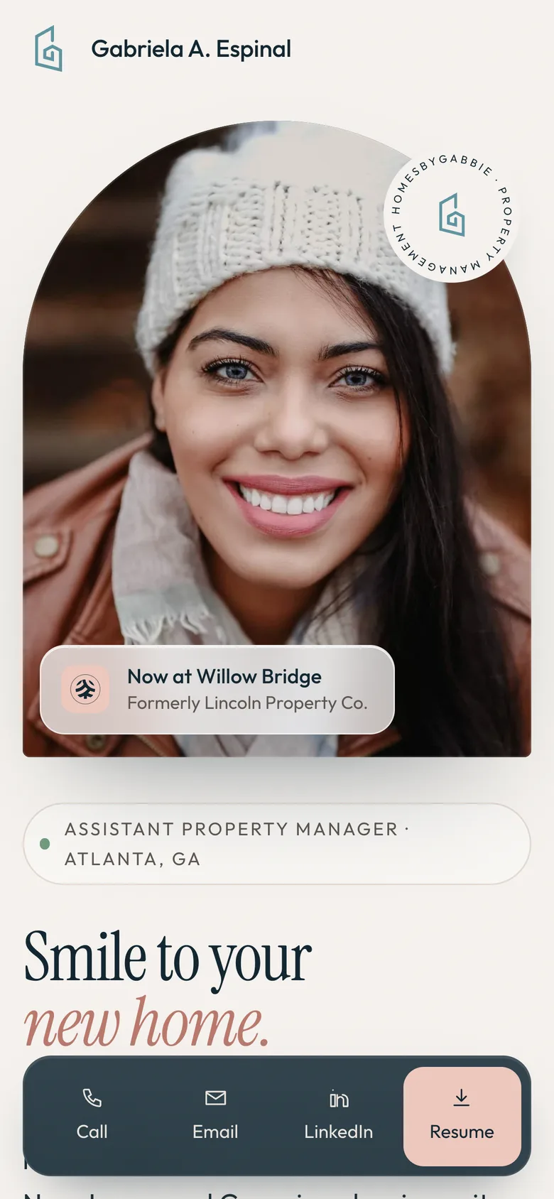
The call button never scrolls away.
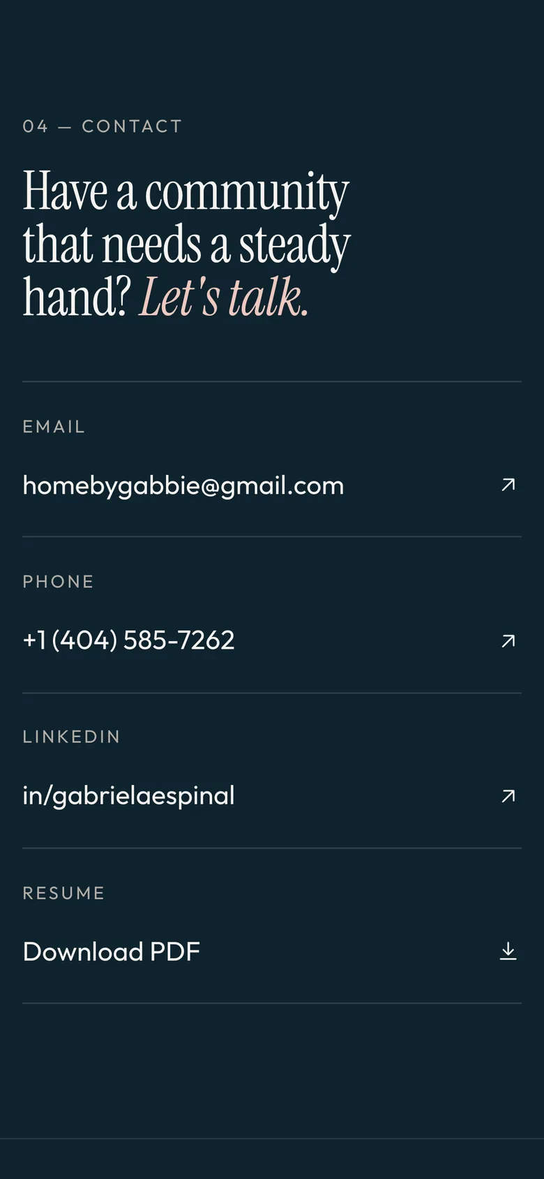
Most people who’d hire a property manager will find her on their phone. On small screens the portrait moves above the headline, and a dock with Call, Email, LinkedIn and Resume stays pinned to the bottom the whole way down.
Brand Kit
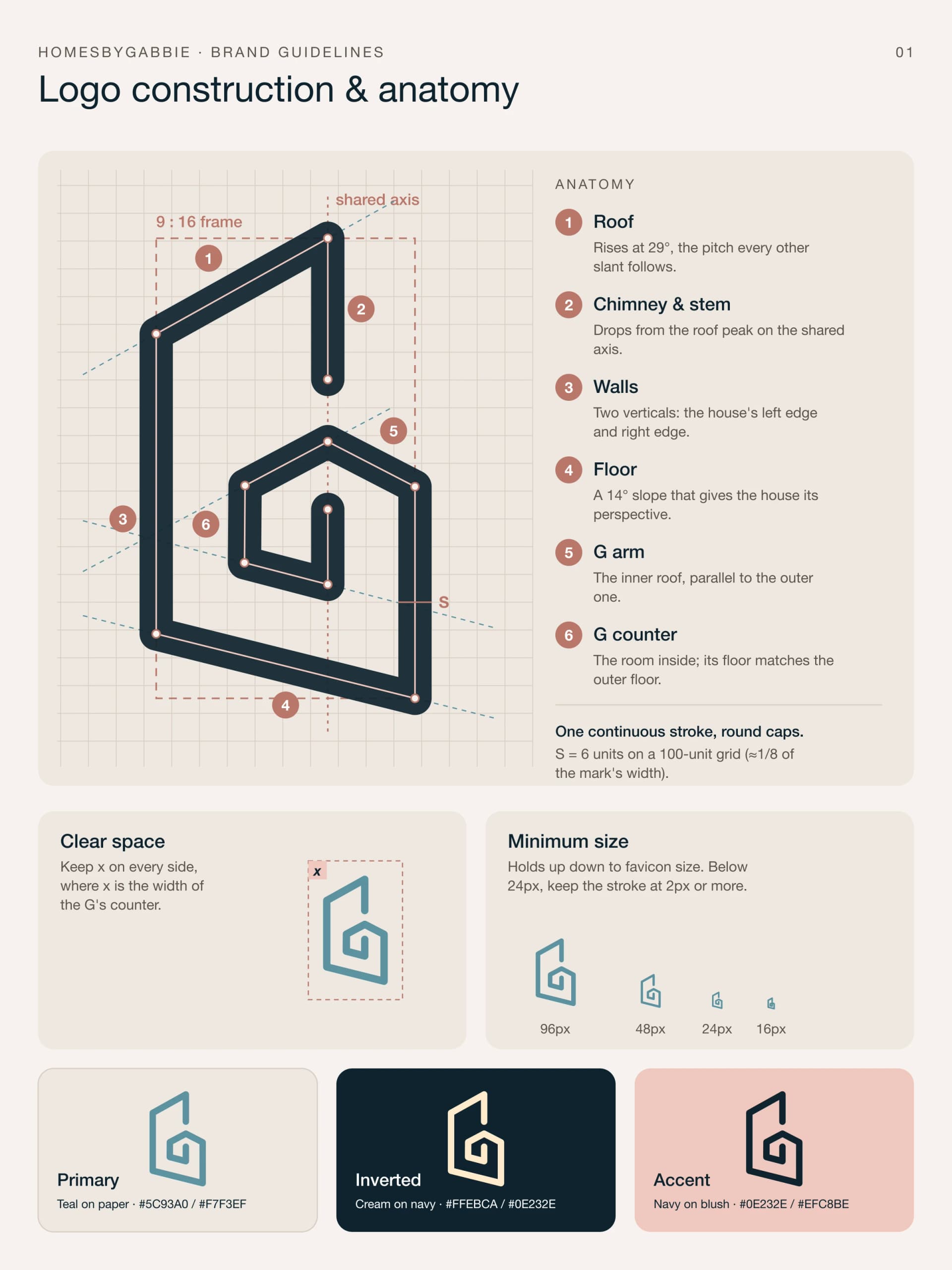
Navy, blush, and a house that’s also a G.
The palette comes from her existing brand assets. The mark is a single stroke, so it animates as a line drawing on the preloader and still holds up at favicon size.


Smile to your new home.
Needs handled quickly and professionally, maintenance addressed before it becomes a complaint.





The tools she works in every day, as they appear in the scrolling strip under the hero.
Decisions
Small site, a few deliberate calls.
Plain HTML, on purpose
One HTML file, one stylesheet and about 130 lines of JavaScript. She can host it anywhere, it loads fast on a phone, and nothing breaks when a dependency updates.
Motion that respects people
Sections fade up as you scroll and the buttons lean toward your cursor. If your device asks for reduced motion, all of it switches off and the preloader skips its wait.
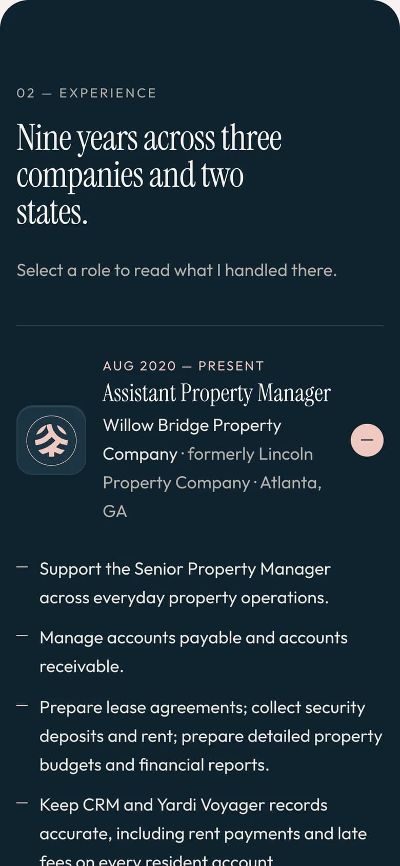
Experience as an accordion
Three roles with a lot of bullet points would be a wall of text. Only one opens at a time, so you pick the job you care about and the rest stays out of the way.
Contact is never more than a tap away
The hero's main button starts an email, the nav has the resume, and on phones a pinned dock keeps Call and Email under your thumb.
Closing note
It’s live. Go have a look.
Screenshots only show so much. The preloader, the marquee and the accordion are all better in person, and it’s worth opening on your phone too.